Wednesday, April 21, 2010

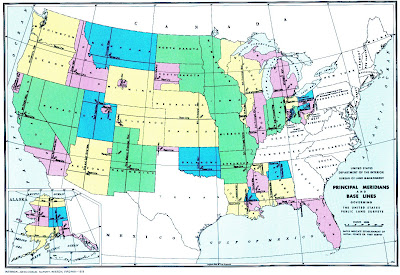
PLSS Map


A public land survey system (PLSS) map is a way of subdividing and describing land in the United States that is owned by the Federal Government for the benefit of American citizens. This is a PLSS map of the entire United States and shows the baselines and principle meridians.

http://gis.nwcg.gov/giss_2006/job_aids/maps_and_graphics/USA_PLSS_Meridians_map.jpg

Mental Map

Mental maps are mental depictions based on a person's point-of-view perception of their own world. Often, these perceptions are influenced by likes, dislikes, mass media, and pride. In this mental map, a sixth grader drew her route to and from school based entirely on memory as well as the influential factors given above. The student left out several buildings such as the power plant, which is directly across from the school because this is a hazardous location and she would prefer not to think about it, let alone draw it.

http://soa.utexas.edu/work/eaejp/Methods/Mental%20map%20from%206th%20grade-f.jpg

Star Plot

A star plot is a graphical data analysis technique for examining the relative behavior of all variables in a multivariate data set. Each spoke represents a different variable in the multivariate data set. This star plot examines the crime rates of various cities across the United States. The length of each of the spokes represents the amount of crime in any one area.

http://www.math.yorku.ca/SCS/Gallery/images/starcrim2.gif

Correlation Matrix

A correlation matrix is a rectangular assortment of numbers that gives the correlation coefficient between one variable and every other variable included in the study. When the variables are compared to themselves the correlation coefficient is always 1 and is displayed diagonally down the chart. This correlation matrix shows the correlations between principle bond and foreign exchange markets among within several countries.

http://www.investors-routemap.co.uk/images/correlation.gif

Similarity Matrix

Similarity matrices are used to express the similarity between two data points. These similarities are mapped across the graph using x and y coordinates. The higher the photo index between the points, the more similar that they are. In this matrix, multiple photos were compared to one another in order to find similarities. The scale on the right was given to show the amount of similarity recorded.

http://www.fxpal.com/systems/MediaAnalysis/sim10000.gif

Stem and Leaf Plot


Stem and leaf plots are tools for representing quantitative data in graphical form. Stem plots preserve data by using at least two significant digits: one in the left (stem) column and one in the right (leaf) column. While there is only one stem for each row, there could be an infinite number of leaves following it. This plot shows the infant mortality rates in Western Africa per 1,000 live births. The first number given combines the stem(5) with it's respective leaf(1) to create the number 51.

http://mainland.cctt.org/mathsummer/JosephBond/StemAndPlots/images/table2.gif

Box Plot


A box plot is an expedient way of graphically representing groups of data through their five-number summaries: smallest observation (sample minimum), lower quartile (Q1), median, upper quartile (Q3), and largest observation (sample maximum). This helps show spread, skewdness, as well as any potential outliers. This box plot shows minimum relative channel elevations for each channel type.

http://www.colorado.edu/research/cires/banff/pubpapers/42/Poole03.gif